Back to the drawing board! UI re-design – Dev Blog 41
This week has had a very UI orientated taste to it. I’ve been busy building mini-prototypes of UI elements, as well as spending a lot of time mocking up interface ideas and testing them. One of the bits of feedback I often get about the game is about the lack of quality to the UI . It’s an aspect of the game I feel is really holding things back. Taking that in mind, I thought it would be worth spending some time coming up with a better way of doing things.
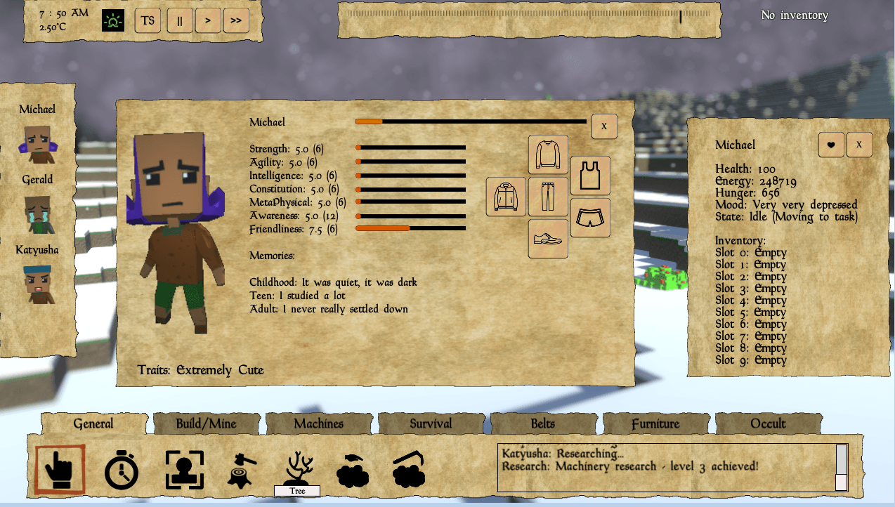
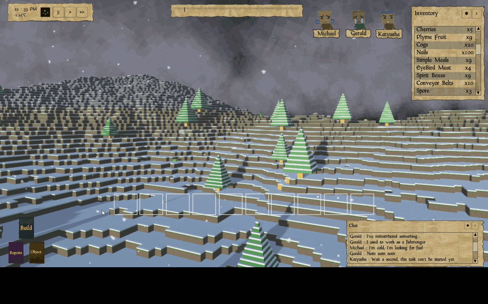
There is a lot of information in Fringe Planet. With a simulator that is par for the course (in fact I take a great deal of pride in the level of detail of the simulation). However, not all of it is needed all of the time. For instance, it doesn’t matter how dirty a peons undershirt is if you are busy fending off an attack from vicious eldritch beasts. It doesn’t matter how many simple meals you have in stock if all your peons are just about to freeze to death.
Currently, the interface throws everything at you at once. All the information and interaction with the world is just right there. However, this amount of control/info is incredibly overwhelming. For me (as the developer) – it makes sense. Everything is where I expect it to be, and it’s quick and easy to test things. But that is a very developer-centric view of the situation.
So the brief for this week has been to make the user interface less overwhelming to use. I’ve been spending a lot of time designing UI ideas with Google Slides. This allows for exceedingly quick prototyping (drag and drop, picture transitions for effects etc;). Also, the online functionality is helpful as well – others can come and have a fiddle with the designs as well. This has allowed me to rapidly iterate through several different designs.
The first step to making the interface less confusing is to split it into three distinct sections of functionality and these are :
| Building/Mining | Anything related to direct voxel manipulation, placing new ones, digging up old ones. |
| Objects | Anything that can be built and placed into the world. |
| Reports | Task manager, peon reports and details, selfie mode, toggling view modes. |
These three sections are accessed via a mode switcher in the corner, the current design is a book to represent each section and clicking on a book will open the appropriate panel. This may change but the functionality will stay the same. With the panels sliding on when this happens, it frees up a lot of screen real estate. Additionally, by removing the chat panel from the main panel and having it floating means that there is a lot more room from icons in these panels.
All windows will have the option to be minimised and pinned. Also, the chat panel has an “invisible” operation mode. By default when a chat message comes in, only the message is displayed. Moving over the panel will expose all the functionality of it. Which will let you scroll and see the historic messages. This can be turned on and off though.
Finally, everyone loves hotbars. So I’ve added them to the interface. This will allow any button to be dragged from the UI and placed in a nice central location. If you’ve got this far, please note the animations are currently all mockups – I’ve not touched any code yet!
So this is the new direction the UI will be taking. I’ve spoken to my very talented artist (the guy who designed the new logo) and he has started work on some new mock-ups. Watch this space for more information!
| Thanks for reading today’s blog post – if you are interested in Fringe Planet and want to keep up to date with all the news, why not sign up the Fringe Planet newsletter? You can sign-up here : https://fringeplanetgame.com/newsletter. |
There is a lot more to read about Fringe Planet… why not try: